
1-800 Contacts generates much of it's revenue from returning customers. However, the web experience for those customers was never optimized nor personalized for them. The value of having prescription data already saved in your account is attractive to customers, and they return to the site hoping for an easy, quick way to reorder their contacts.
My Role: Senior Product Designer
Team: Tyler North (Product Manager), Mark Milburn, Darian Everett, Tally Wilsher, Tyler Winzenreid (Engineers)
Context of the Problem:
Return customers were logging in, then stumbling through a new customer order flow, causing duplicate accounts, too many service calls, lower conversion, and a lot of confusion. In user sessions, we observed customers logging in, then navigating back and forth around their account pages before finding what they were looking for (typically, a way to update their contacts prescription or reorder the contacts they previously ordered). We also heard feedback from our call center agents that customers would call in confused about how to reorder.
Because the web product did not have a reorder experience for returning customers, instead they were routed directly to a pre-loaded cart after logging in, with no context as to why. It was jarring and confusing and wasn't leading to ideal conversion. For customers who did eventually convert, it was a frustrating experience. Forcing customers to trip their way through an awkward order flow was not serving anyone.
Proposed Solution:
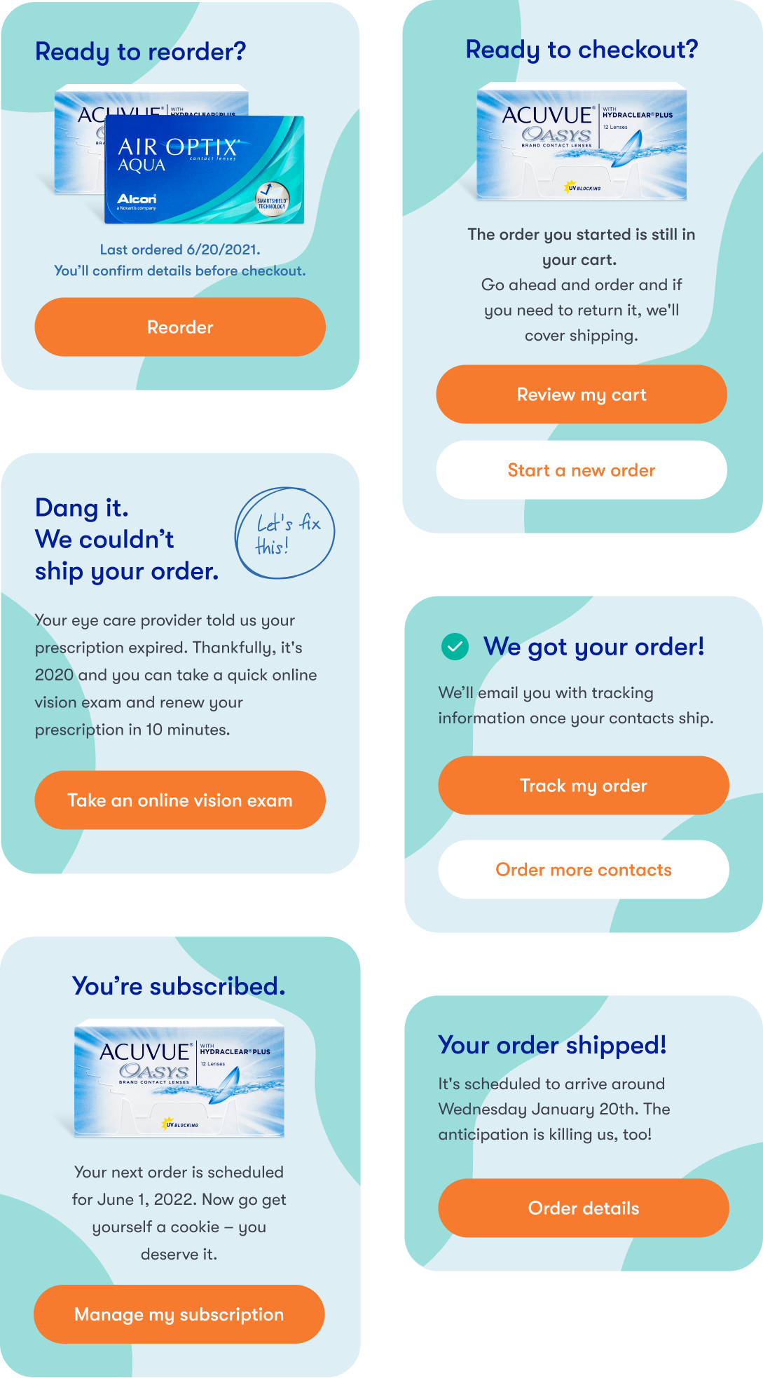
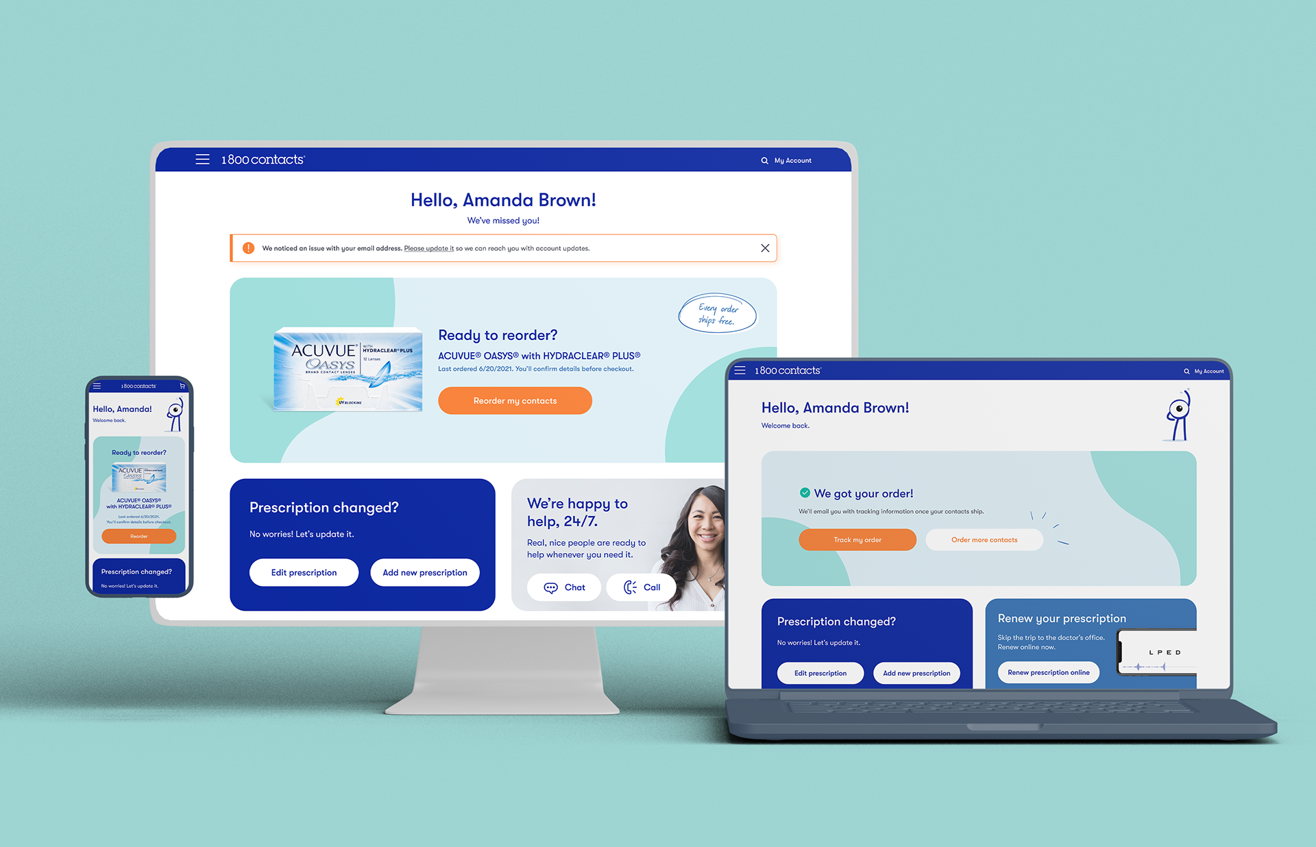
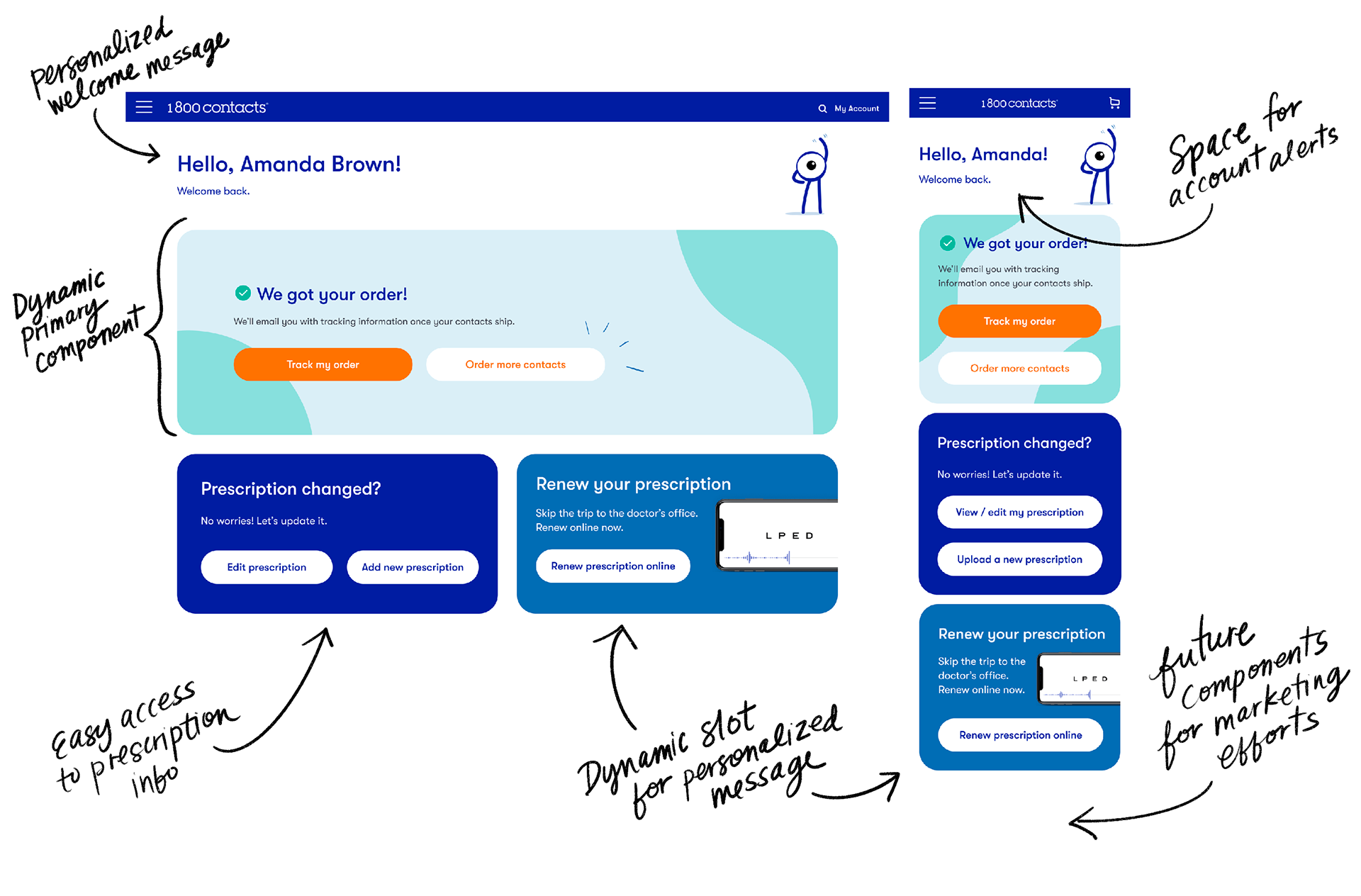
Create a Return Customer Dashboard for returning customers to facilitate a smoother reorder flow and easy navigation around their account and contacts prescription options.
As part of the new design, create a personalized experience using customer data to show the customers what they likely were logging in to look for, while providing easy access to every option on the site. High importance on creating a design that can easily be utilized with personalized components from a customer data platform.
Approach:
My approach with this project was to lean heavily on user testing and iterative A/B testing to come to a great MVP. I worked closely with my engineers to create a concept that functions well with dynamic content.
Before wire-framing up initial prototypes, I collected data on the different types of experiences our data would support. Asking questions like, "What do we know about customers who ordered this week? What about customers who haven't ordered in 2 years? What about customers who have a subscription? What about customers who've never ordered a product before, but have an account?"
There were so many scenarios to personalize the experience. We decided to start with the basics: Ready to reorder (clearly showing the most recently ordered product and prescription), recent order, shipped order, subscription, and abandoned cart.
After several rounds of prototypes and moderated user testing, our final MVP was released as an A/B test to 50% of our customers.
Outcome:
Our initial test ran for 3 weeks. We saw an immediate positive response from customers. This MVP resulted in an increased conversion of 2%, an increase in revenue per visitor of 3%, an an annual impact of an increase in $2.3MM in revenue.
What was even more exciting was how it provided a basis for further efforts into personalization and marketing campaigns.